24.11.2023
3
Like
49
Views
Learn Css Grid Style Layout In 10 Minutes
A grid can be defined as an intersecting set of horizontal lines and vertical lines. CSS Grid layout divides a page into major regions. It defines the relationship between the parts of a control built from HTML primitives in terms of layer, position, and size. Grid property offers a grid-based layout system having rows and columns. It makes the designing of web pages easy without positioning and floating.
Similar to the table, it enables a user to align the elements into rows and columns. But compare to tables, it is easy to design layout with the CSS grid. We can define columns and rows on the grid by using grid-template-rows and grid-template-columns properties.
The CSS grid property is supported in browsers such as Google Chrome, Internet Explorer, Firefox, Safari, and Opera.
OUTPUT
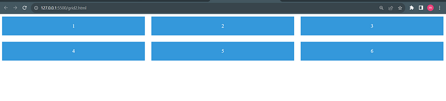
- The
.containerclass is set todisplay: grid, defining it as a grid container. grid-template-columnsdefines the number and size of columns. In this case, it creates three columns of equal width.grid-gapsets the gap between grid items.- Each child element with the class
.itembecomes a grid item
Comments
You need to log in to be able to comment!